See what changed at a glance
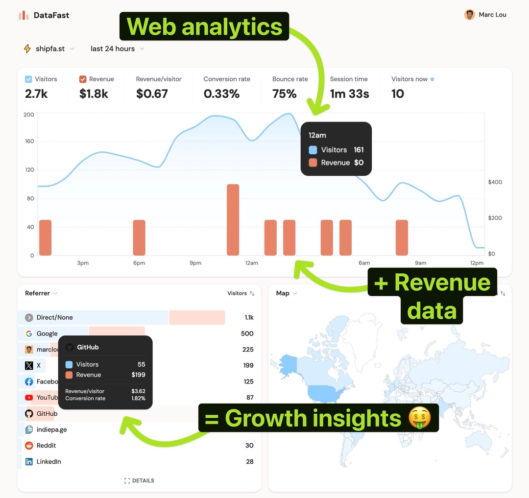
You can now compare the selected period with the previous one directly on your main dashboard chart.
Visitors show as a dashed comparison line, revenue and MRR show as faded bars, and the KPI row shows previous-period values below your current metrics.
Click Compare next to the granularity selector on your dashboard to start.
Something missing? Suggest features ✍️